So many times I hear clients say, “I don’t think I look good in that color” or “That doesn’t look good with my skin tone”. That maybe true in the day to day but not in photos. In photos, wardrobe plays on the background location way more than your skin tone. Let me explain 2 things about that…
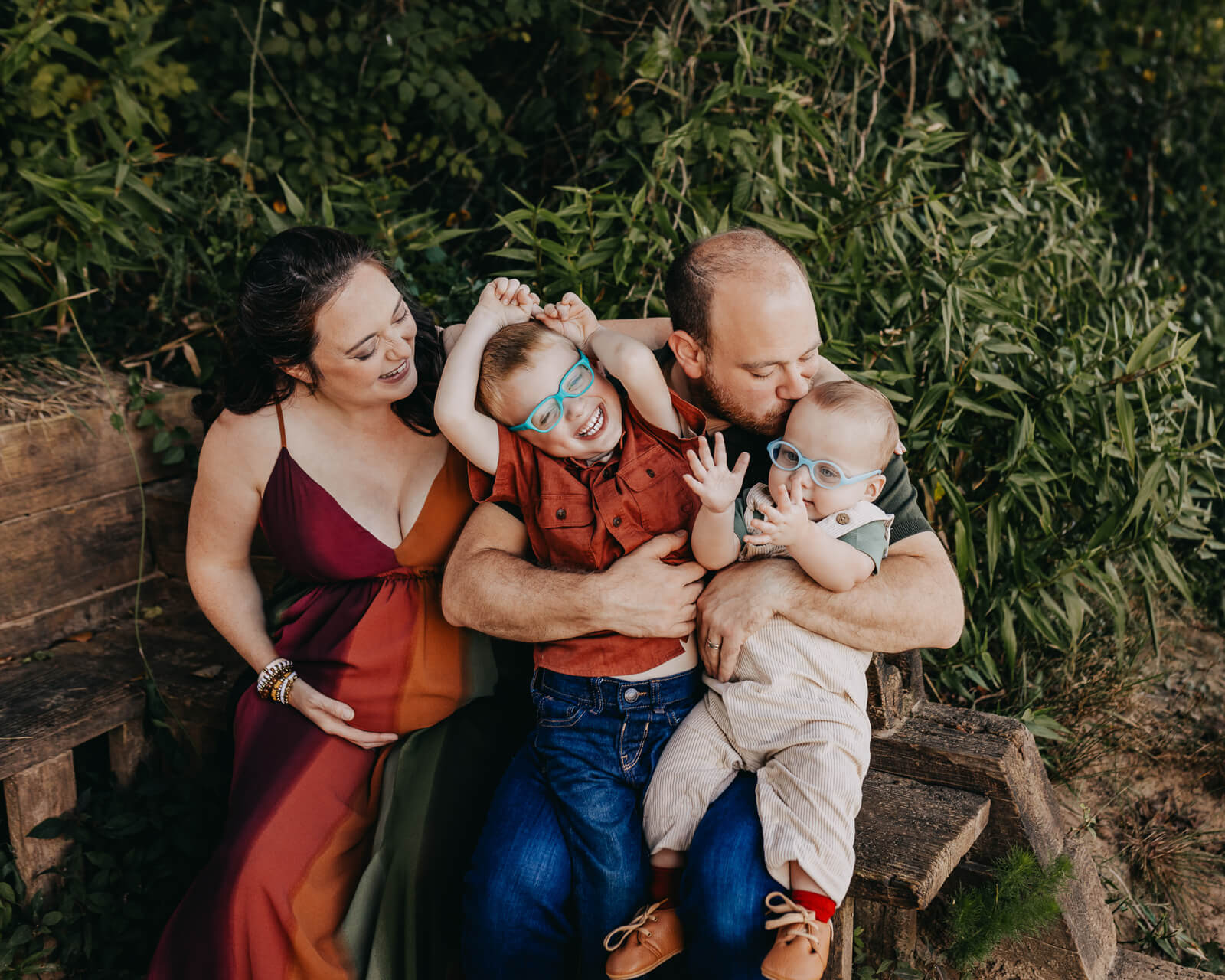
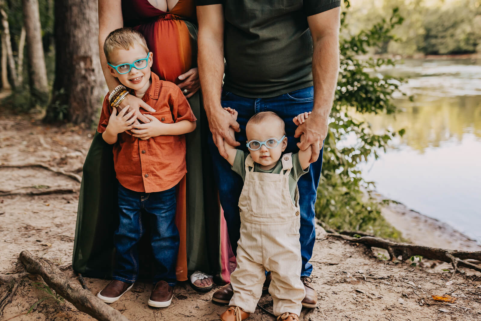
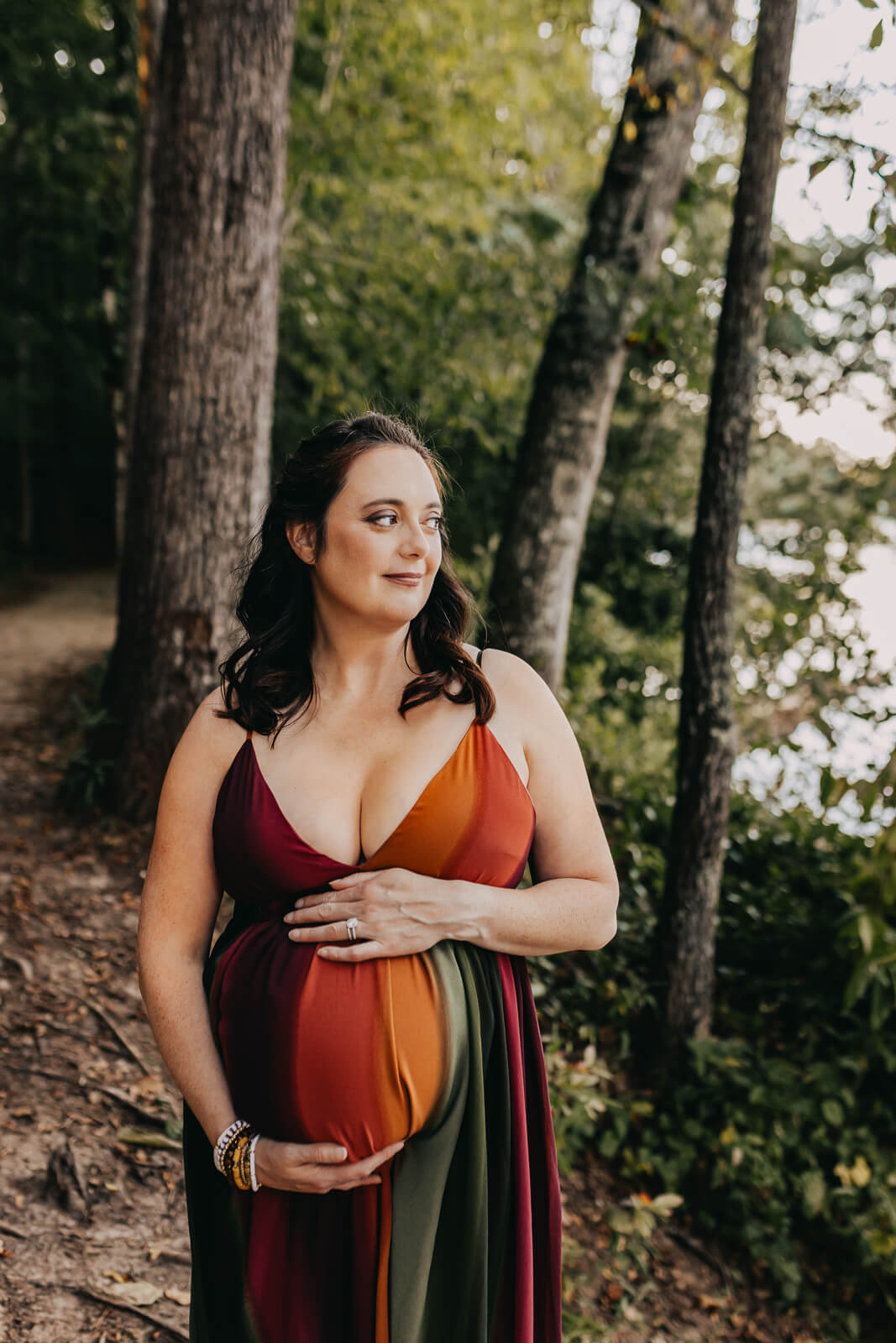
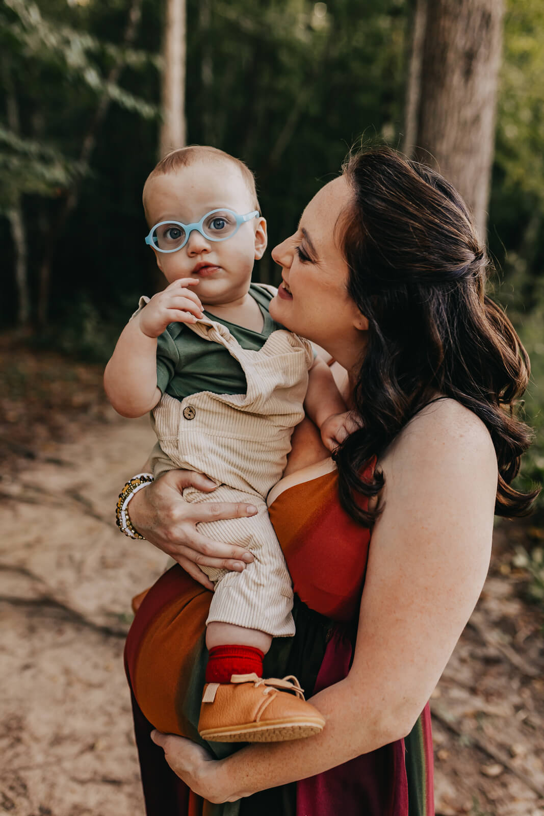
1. Look at images you are inspired by. Do you like calming images? Go with a mix of neutrals and colors similar to your backdrop. Do you like contrast? Dress in some white or cream contrasted with black, navy or deep green. Do you like your images to pop? Use bold colors that are the opposite of your background. Green field? Use rust or brick… it’s the opposite of the color wheel of green (my favorite combo). OR do you have a spot in your home that you want to hang these framed images? Pick colors that will go well with your decor.
It is MY job to make sure your skin tone is looking great no matter the color you wear! So leave that logic behind!
2. Listen to your Photographer. There are reasons why we prefer some colors over others. Most of the time it is the backdrop, or the light, not your skin tone. Or our editing style from years of doing this. We know what will make a photo stunning consistant to what you see in our portfolio. Trust your photographer- not your bestie’s or neighbors opinion on this.
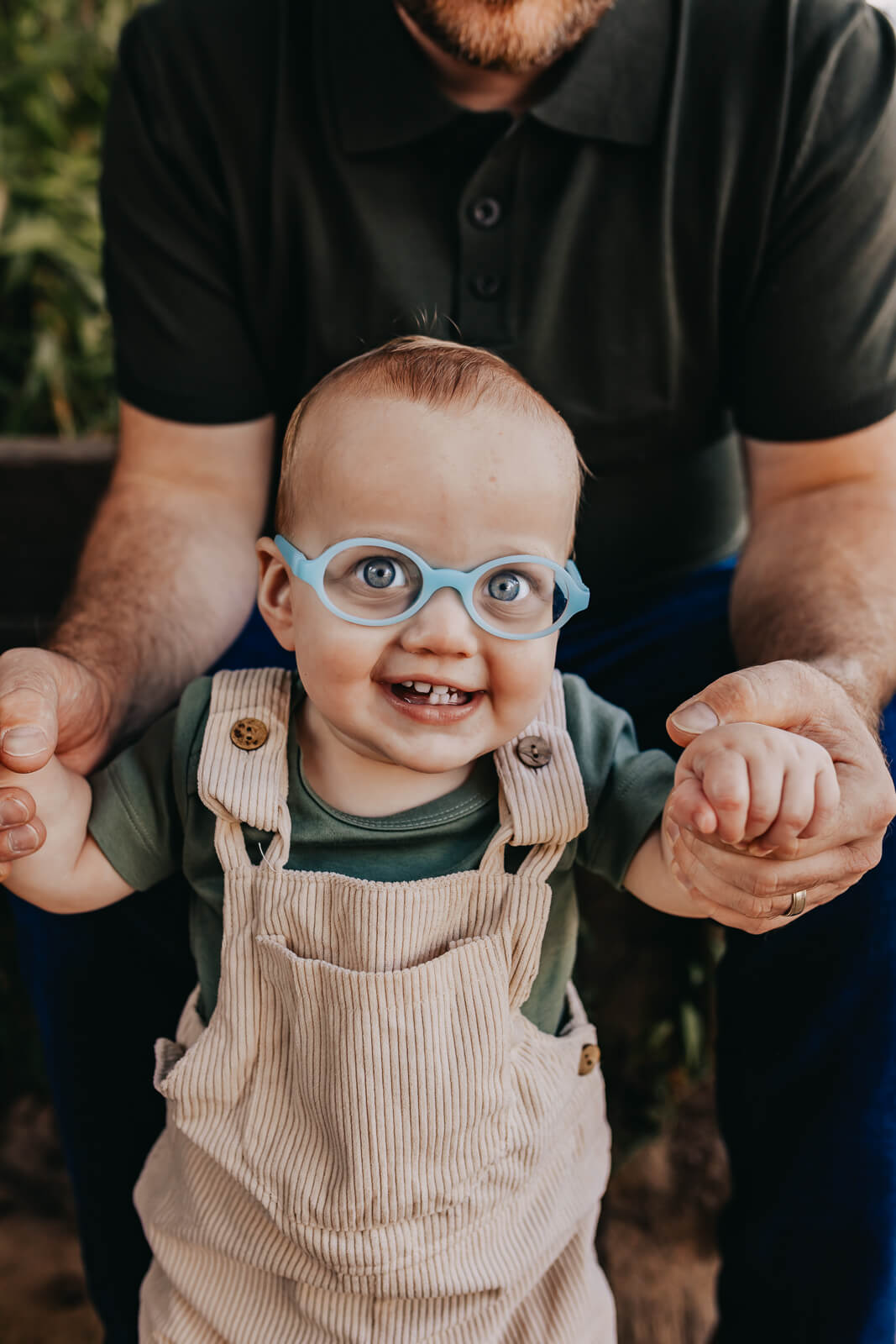
This client and I worked together to make these images stunning. She liked bold so we went with it based on the location choosen. Loving the how it all came together.